
The Ariosa logo is designed to be technical yet human, optimistic, detailed, and trustworthy. The Harmony logo is designed to be smart, nurturing, optimistic. Both logos feature an asterisk with a multi-faceted meaning: a future child, test results, a droplet of blood (in reference to the simple blood draw nature of the test).
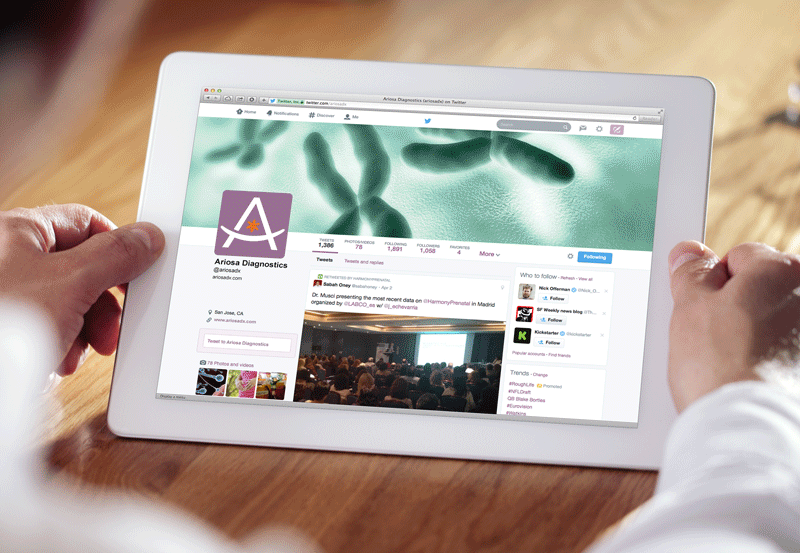
Companion social media designs were created; the parent company focused on the healthcare professional while the product focused on the patient.

The brochures were translated into dozens of languages around the world and a style guide was developed to accommodate the different languages.
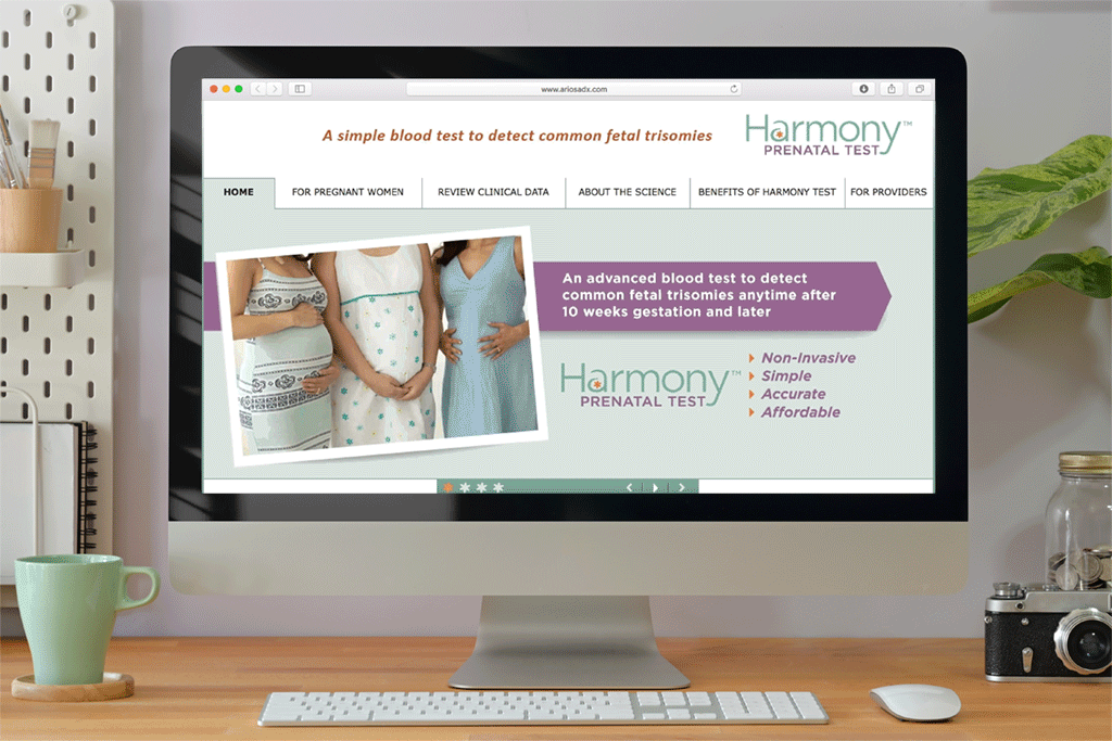
The website contained information suitable for both the patient and healthcare professional. Rather than completely dividing the two groups on the website, patients are given access to the same information healthcare professionals have without over-simplification.